
Monday, 25 October 2010
Final Poster.
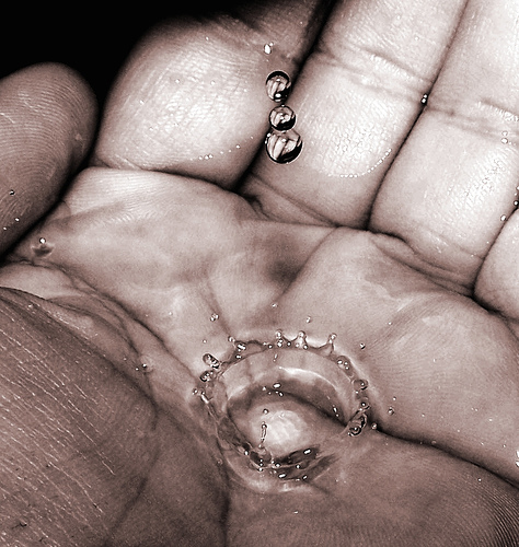
Below is the image I have chosen to use as my final poster for the 'Water is Life' project.


Saturday, 23 October 2010
Experimenting with Type.

I was playing around with type positioning, but found that because some of the words were wonky, it looked very unprofessional, so I tried again with all the words straight:

I wanted to create an effect where it looked like all the water-related diseases were being washed down the drain, so I layered the text over an image I had taken of a sink:


At any given time, half of the world’s hospital beds are occupied by patients suffering from a water-related disease. [http://www.water.cc/].
Thursday, 21 October 2010
Mock up.
Another mock up of a poster I created for the 'water is life' brief, in the style of 'a softer world' as researched below.
I like how this has turned out but it still needs a lot of work done to it re: text placement, spacing between images, border effects and image composition.

I like how this has turned out but it still needs a lot of work done to it re: text placement, spacing between images, border effects and image composition.

Wednesday, 20 October 2010


A Softer World.
"A Softer World is a comic that was created by Emily Horne and Joey Comeau so that people would recognize them as important artistic geniuses. Sometimes the "comic" is sad or harsh. It should be noted that this is in the tradition of George Simenon's 'romans durs' (or 'hard novels') and not in the lesser traditions of comics like Peanuts or anything else not French. Comeau is a French name. (Pronounced kuh-moe, by the way. Joey is very important, please say his name correctly. Emily is also very important but her name is easier to pronounce.) "This is one of my favourite websites. I like their use of photography to get across messages, with little captions, in a cartoon-strip style. The messages they portray are both tongue-in cheek... I'd like to try to incorporate their style into my photography poster, but make it more serious.
Some examples of their work:


You can view an archive of their work at: http://www.asofterworld.com/archive.php
My photos...
I decided to take these photographs (see previous post) in black and white, to make them more striking. I took these photos in the dark and used a flash, and i like the way they have turned out kinda gritty. I think this fits in with the project well, as it is a serious matter I want my photos to look serious and send out a message.


Monday, 18 October 2010
Ideas.
I want to use Photography to get my point across. I will then use these photos in a series of posters, emphasising how important water is and what it's main uses are.
Water in Photography:


Water in Photography:
[http://www.manataka.org/images/glass_of_water.jpg]


What is water used for?
Obviously the most important use of clean water would be for drinking. (which in turn keeps us healthy, hydrated & energised.)
Other uses include:

Other uses include:
- showering/bathing/washing ourselves.
- rain --> agricultural benefits, such as helping plants and trees to grow, which in turn created food.
- cleaning: houses, cars, etc.
- cooking: water is used for boiling food, making certain dishes, tea/coffee etc.
- transportation: without water, we could not fly planes, drive cars, sail boats.
Q: How can I incorporate all these points to make an effective series of posters?
pro: two. Water is Life.
2D Illustration/Graphic Design.
"Younger generations are prepared to bear their share of the responsibility".

"Younger generations are prepared to bear their share of the responsibility".
My aim will be to create a series of 3 posters to publicise the message that 'Water is Life'.
Tuesday, 5 October 2010
advertising
Eggy Pop & the Stooges needed to make-over their advertising campaign to keep up with their new image.

I scanned in a musical background, which i created out of old wrapping paper, then added some photoshop effects.
This will become their new advertising poster:


I scanned in a musical background, which i created out of old wrapping paper, then added some photoshop effects.
This will become their new advertising poster:

make-over
These eggs really needed to update their image, so I tried them out with a few different styles:


I think the rock/metal style in the middle row is definitely my favourite and will use this from now on.
research
A few examples of rock posters used to advertise Iggy Pop & the Stooges, which I have drawn inspiration from: I like the bold writing and cut-out pop art effects.


eggy pop & the stooges
My band of eggs will be named "Eggy Pop & the Stooges'.
As the eggs are my clients, I will be their band manager and make-over their image in a hope to be a lot more successful.

As the eggs are my clients, I will be their band manager and make-over their image in a hope to be a lot more successful.

research
I came across a few images of eggs that have been made into figurines of rock stars. I like this concept; however, I think I would prefer to do mine from a more 2D perspective.


idea
From experimenting with some rough sketches of eggs, I have decided that I would like to make a rock band of eggs, and brainstormed to think of a good name for them:


24hr one: eggs
The brief: "I am an egg, I am your client'.
A very ambiguous brief. I brainstormed a few ideas to see what direction this project will take me:

A very ambiguous brief. I brainstormed a few ideas to see what direction this project will take me:

Monday, 4 October 2010
information to be included on the poster:
The Recovery Position, step by step:


 Black & White:

- place patients arm closest to you at a right angle by their head
- place back of their hand on cheek
- pull knee up and towards you
- roll patient onto their side
- tilt head back, list chin and check they are breathing.
To begin, I took photos of my parents in the various stages as mentioned above:


I then photoshopped these images to create a pop-art/cartoony effect, and used inDesign to place them in posters:
Colour:


Subscribe to:
Comments (Atom)
